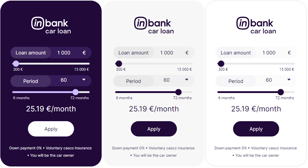
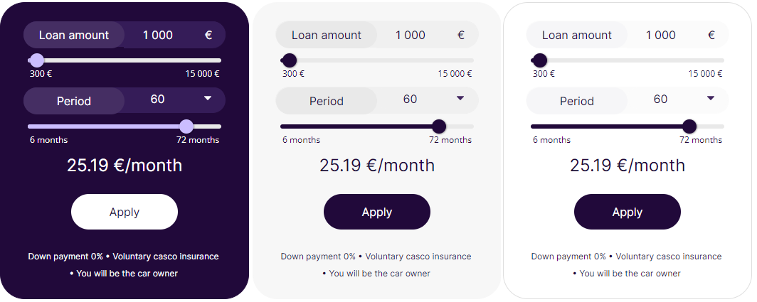
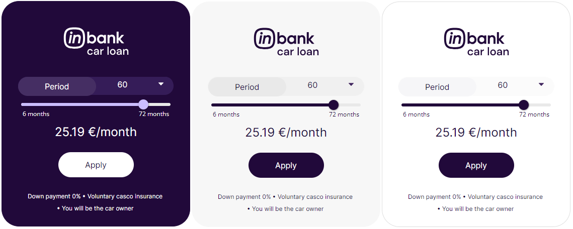


 Default color combinations for backgrounds purple, grey and white in text template with representative sample. Dimensions h=195, w=350.
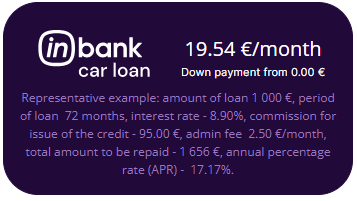
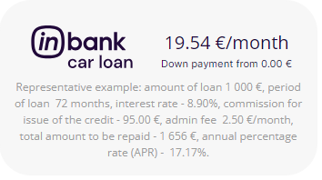
 Default color combinations for backgrounds purple, grey and white in text template without the Inbank logo. Dimensions h=100, w=240.


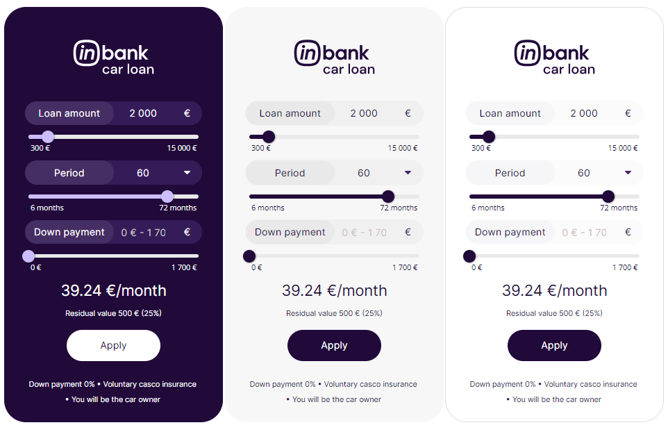
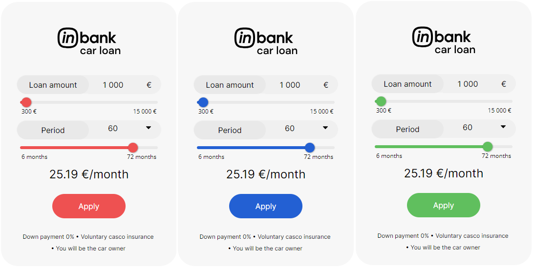
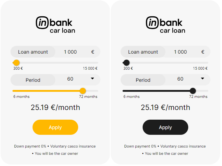
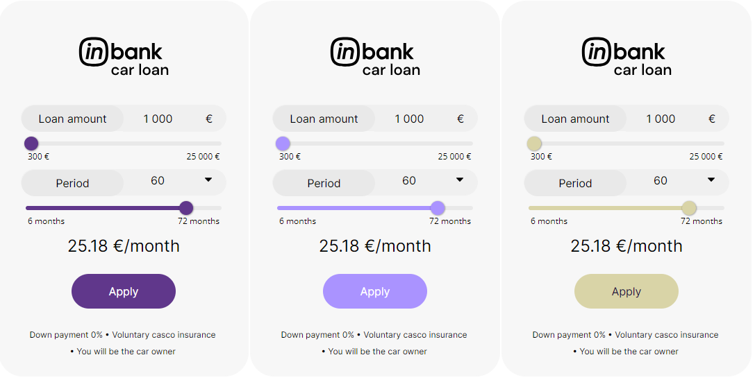
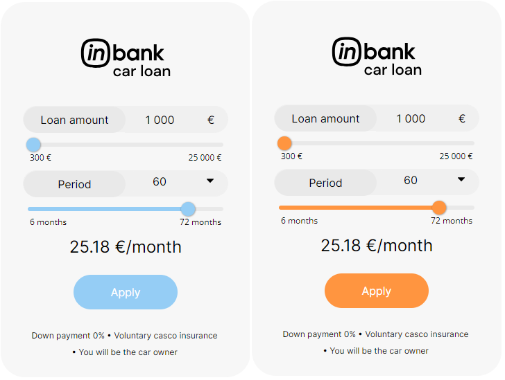
 Color customization options with grey background and template with editable amount. The same customizations are also available for other background colors and uneditable amount template. There is also the option of not displaying the Inbank logo as well. Dimensions h=570, w=360.
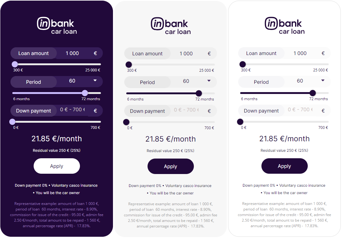
 Note that for calculations used in Latvia and other cases when there is a need to show the representative sample, example dimensions for a calculator that has two sliders and an `Apply` button are:
- w=400, h=660 for vertical layout
- w=360, h=195 for text calculator template
# Including Product Data into the Calculator Configuration
In the iFrame example [provided above](#addCalculator), all parameters are set to a static value. However, it is expected that the vehicle price is taken from the product page. For example, in WordPress with the WooCommerce e-commerce plugin the price can be extracted like this:
- Have the product defined as `$product` in the .php file in which you want to add the calculator.
- When assembling the iFrame URL, replace the amount value with `get_price(); ?>`.
```
global $product;
```
Similarly, the vehicle brand, model and image link can be automatically inserted from the product page:
- To automatically insert the vehicle brand, set the make parameter to `get_attribute( 'make' ); ?>`
- To automatically insert the vehicle model, set the model parameter to `get_attribute( 'model' ); ?>`
- To automatically insert the vehicle brand, set the image_url parameter to `get_attribute( 'imageURL' ); ?>`
```
global $product;
```
Please note, the code samples above are examples and the implementation details may differ based on the setup of your site.
# Responsive Calculator Implementation
WIDTH:
For responsiveness you need to take into account different screen sizes or set the iFrame width in percentages or 'auto', depending on how your website is built (for example, width="auto" OR width="100%"). This will then set the iFrame width depending on the parent element. If the parent element is 500px wide then the calculator maximum width can also be maximum 500px.
Common breakpoints for widths of devices:
- 320px — 480px: Mobile devices
- 481px — 768px: iPads, Tablets
- 769px — 1024px: Small screens, laptops
- 1025px — 1200px: Desktops, large screens
- 1201px and more — Extra large screens, TV
HEIGHT:
On the other hand, you need to set the height depending on the width of the calculator, for example, the more the calculator shrinks (gets smaller in width) the more height it needs. This can be done with showing different blocks via:
- Bootstrap: Grid examples (d-block, d-md-block, d-lg-block, d-xl-block, d-xl-none, d-lg-none, d-md-none, d-none)
- React Material UI - https://mui.com/system/display/#hiding-elements
- Pure CSS - https://www.freecodecamp.org/news/css-media-queries-breakpoints-media-types-standard-resolutions-and-more/
With PURE CSS you need to define all the media types and sizes and inside them you either display a block or you do not display a block.
You can find two basic calculator implementation examples below (based on Bootstrap and React Material UI).
## Bootstrap Example
Insert code below here to test it out and understand what it does and how it's working - https://www.w3schools.com/bootstrap4/tryit.asp?filename=trybs_grid_examples1&stacked=h
If you want more precise elements you can also make more divs with different blocks to show and not to show and set the height in each iFrame.
```
Note that for calculations used in Latvia and other cases when there is a need to show the representative sample, example dimensions for a calculator that has two sliders and an `Apply` button are:
- w=400, h=660 for vertical layout
- w=360, h=195 for text calculator template
# Including Product Data into the Calculator Configuration
In the iFrame example [provided above](#addCalculator), all parameters are set to a static value. However, it is expected that the vehicle price is taken from the product page. For example, in WordPress with the WooCommerce e-commerce plugin the price can be extracted like this:
- Have the product defined as `$product` in the .php file in which you want to add the calculator.
- When assembling the iFrame URL, replace the amount value with `get_price(); ?>`.
```
global $product;
```
Similarly, the vehicle brand, model and image link can be automatically inserted from the product page:
- To automatically insert the vehicle brand, set the make parameter to `get_attribute( 'make' ); ?>`
- To automatically insert the vehicle model, set the model parameter to `get_attribute( 'model' ); ?>`
- To automatically insert the vehicle brand, set the image_url parameter to `get_attribute( 'imageURL' ); ?>`
```
global $product;
```
Please note, the code samples above are examples and the implementation details may differ based on the setup of your site.
# Responsive Calculator Implementation
WIDTH:
For responsiveness you need to take into account different screen sizes or set the iFrame width in percentages or 'auto', depending on how your website is built (for example, width="auto" OR width="100%"). This will then set the iFrame width depending on the parent element. If the parent element is 500px wide then the calculator maximum width can also be maximum 500px.
Common breakpoints for widths of devices:
- 320px — 480px: Mobile devices
- 481px — 768px: iPads, Tablets
- 769px — 1024px: Small screens, laptops
- 1025px — 1200px: Desktops, large screens
- 1201px and more — Extra large screens, TV
HEIGHT:
On the other hand, you need to set the height depending on the width of the calculator, for example, the more the calculator shrinks (gets smaller in width) the more height it needs. This can be done with showing different blocks via:
- Bootstrap: Grid examples (d-block, d-md-block, d-lg-block, d-xl-block, d-xl-none, d-lg-none, d-md-none, d-none)
- React Material UI - https://mui.com/system/display/#hiding-elements
- Pure CSS - https://www.freecodecamp.org/news/css-media-queries-breakpoints-media-types-standard-resolutions-and-more/
With PURE CSS you need to define all the media types and sizes and inside them you either display a block or you do not display a block.
You can find two basic calculator implementation examples below (based on Bootstrap and React Material UI).
## Bootstrap Example
Insert code below here to test it out and understand what it does and how it's working - https://www.w3schools.com/bootstrap4/tryit.asp?filename=trybs_grid_examples1&stacked=h
If you want more precise elements you can also make more divs with different blocks to show and not to show and set the height in each iFrame.
```
Use the .col class on a specified number of elements and Bootstrap will recognize how many elements there are (and create equal-width columns). In the example below, we use two col elements, which gets a width of 33.33% and 66.66%
BIG CALCULATOR
SMALL CALCULATOR
Lorem Ipsum is simply dummy text of the printing and typesetting industry. Lorem Ipsum has been the industry's standard dummy text ever since the 1500s, when an unknown printer took a galley of type and scrambled it to make a type specimen book. It has survived not only five centuries, but also the leap into electronic typesetting, remaining essentially unchanged. It was popularized in the 1960s with the release of Letraset sheets containing Lorem Ipsum passages, and more recently with desktop publishing software like Aldus PageMaker including versions of Lorem Ipsum
Lorem Ipsum is simply dummy text of the printing and typesetting industry. Lorem Ipsum has been the industry's standard dummy text ever since the 1500s, when an unknown printer took a galley of type and scrambled it to make a type specimen book. It has survived not only five centuries, but also the leap into electronic typesetting, remaining essentially unchanged. It was popularized in the 1960s with the release of Letraset sheets containing Lorem Ipsum passages, and more recently with desktop publishing software like Aldus PageMaker including versions of Lorem Ipsum
Lorem Ipsum is simply dummy text of the printing and typesetting industry. Lorem Ipsum has been the industry's standard dummy text ever since the 1500s, when an unknown printer took a galley of type and scrambled it to make a type specimen book. It has survived not only five centuries, but also the leap into electronic typesetting, remaining essentially unchanged. It was popularized in the 1960s with the release of Letraset sheets containing Lorem Ipsum passages, and more recently with desktop publishing software like Aldus PageMaker including versions of Lorem Ipsum
BIG CALCULATOR
SMALL CALCULATOR
Lorem Ipsum is simply dummy text of the printing and typesetting industry. Lorem Ipsum has been the industry's standard dummy text ever since the 1500s, when an unknown printer took a galley of type and scrambled it to make a type specimen book. It has survived not only five centuries, but also the leap into electronic typesetting, remaining essentially unchanged. It was popularized in the 1960s with the release of Letraset sheets containing Lorem Ipsum passages, and more recently with desktop publishing software like Aldus PageMaker including versions of Lorem Ipsum